
MOBILE
BOOK'D
In just a few short years, mobile dating has become a true cultural disruptor. Currently, it is the most common way for people to start a relationship. As many as 40 million Americans are regularly using dating apps now. In a study of 14,000 recently engaged or married Americans, as many as 19% of respondents met online. However, the online dating process is far from perfect. Talk to anyone using Tinder and Bumble and they’ll voice similar frustrations. They’ll often say it’s too superficial and it’s not a good way of authentic communication. From interviews I’ve conducted with people on Tinder and Bumble, about 1 in 100 matches will lead to an actual date. This leaves most users either on dating apps to collect likes or they’re simply unsatisfied with their quality of matches. It’s time to take a different approach.
Role: Visual and Interaction Designer
Platform: Mobile Application
Tools: Adobe XD, Sketch, FlowMapp, Pencil, and Paper.
Challenge
Many people on common dating apps such as Tinder and Bumble have become frustrated. They will often say that dating apps feel like a game or that it’s too superficial. I wanted to create a different approach in how we meet people through mobile apps.
Solution
In order to create more meaningful connections that are less about looks and more about shared interests, I’m proposing a mobile app that suggests people based on book preferences. No swiping involved because people are more than just a quick “yes” or “no”.
Objectives
• Research pain points in online dating
• Explore alternate solution to swiping in dating apps, while focusing on transparency
• Create user flow for alternate solution
• Practice interaction design, visual design, and prototyping in Adobe XD
• Iterate design based on feedback
• Create high-fidelity prototype
User Flow
Most dating apps require you to swipe left or right depending on how a person looks. Whoever shows up on your Tinder or Bumble stack is based on an undisclosed algorithm that’s most likely based on looks or desirability. It can be addicting, mindless, shallow, and even detrimental if people are using it for quick validation. That can take away from the purpose of these apps. I wanted to create a user flow that required more deliberate actions, so you can get more deliberate results. The main idea is that suggested users will show up based on which books you’ve put in your library. It’s a simple and transparent way of finding someone with a few things in common with you. If you just finished reading a book, you can add it to your library and see who else nearby has also read it. Then you can initiate a conversation from there.


Wireframes
Originally scribbled designs on journals and whiteboards. Then created wireframes in Sketch as a reference for higher-fidelity screens.
Profile
Library

Add To Library

Messaging

Design Iteration
My first iteration drew a lot of inspiration from Apple’s iOS and MacOS design language. This includes a lot of colors, gaussian blurs, and drop shadows. After presenting an early prototype to a Senior Design Manager during a portfolio critique, she pointed out that although the design is flashy, it doesn’t make much sense in terms of cohesion or accessibility. The text was too hard to read and elements were too cluttered. It needs easier to read with fewer distractions.
So it was back to the drawing board.


Visual Design
The visual design was inspired by magazine layouts. To be consistent with the literary theme of the app, I observed popular magazines such as Wired and National Geographic. I used conventional design practices such as a sans serif header and a serif body text. The main emphasis was to create a clean UI that’s also intuitive.
I chose fonts and colors to maximize contrast and readability. Black against white has a ratio of 21:1 according to WCAG standards, which is well past the 7:1 ratio required for a AAA rating. I increased both the header and body fonts to a minimum of 14pts based on designer feedback. Moving away from the original Futura font, I made sure the sans serif font I used this time contrasted enough with the body text. The serif font used in the body text is Baskerville, which is one of the fonts you would see on an Amazon Kindle, a device that prioritizes readability as a main function.
While conducting in-person comparisons, all users preferred the new style over the first iteration. They cited clarity, cohesiveness, and cleanliness as why the new design is better.
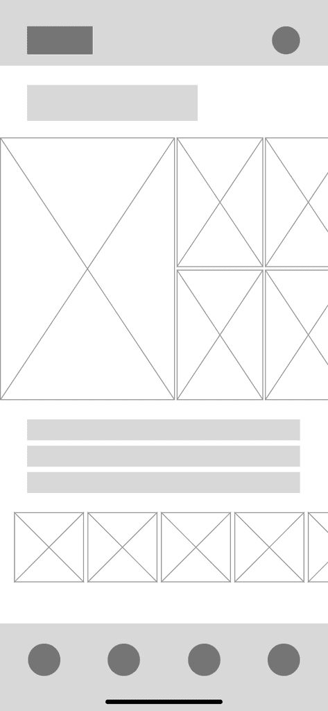
Here’s the visual style in action. The side to side scrolling for profile photos is used to maximize space so that parts of the user’s library can still be seen on screen.
Signup and Profile Creation
One of the main elements of Book’d is your personal library. When searching for a book and adding it your library, you can view who else in the area has also read it. This demo shows a brand new user adding their first book their library.
Creating a Connection
This video walkthrough shows how the Suggestions page shows which users have read the same books as you. In this story, they both have just finished reading “11/22/63” by Stephen King and immediately had something to talk about.
High Fidelity
The visual design was inspired by magazine layouts. To be consistent with the literary theme of the app, I observed popular magazines such as Wired and National Geographic. I used conventional design practices such as a sans serif header and a serif body text. The main emphasis was to create a clean UI that’s also intuitive.
I chose fonts and colors to maximize contrast and readability. Black against white has a ratio of 21:1 according to WCAG standards, which is well past the 7:1 ratio required for a AAA rating. I increased both the header and body fonts to a minimum of 14pts based on designer feedback. Moving away from the original Futura font, I made sure the sans serif font I used this time contrasted enough with the body text. The serif font used in the body text is Baskerville, which is one of the fonts you would see on an Amazon Kindle, a device that prioritizes readability as a main function.
While conducting in-person comparisons, all users preferred the new style over the first iteration. They cited clarity, cohesiveness, and cleanliness as why the new design is better.
Here’s the visual style in action. The side to side scrolling for profile photos is used to maximize space so that parts of the user’s library can still be seen on screen.


Style Guide
The visual design was inspired by magazine layouts. To be consistent with the literary theme of the app, I observed popular magazines such as Wired and National Geographic. I used conventional design practices such as a sans serif header and a serif body text. The main emphasis was to create a clean UI that’s also intuitive.
I chose fonts and colors to maximize contrast and readability. Black against white has a ratio of 21:1 according to WCAG standards, which is well past the 7:1 ratio required for a AAA rating. I increased both the header and body fonts to a minimum of 14pts based on designer feedback. Moving away from the original Futura font, I made sure the sans serif font I used this time contrasted enough with the body text. The serif font used in the body text is Baskerville, which is one of the fonts you would see on an Amazon Kindle, a device that prioritizes readability as a main function.
While conducting in-person comparisons, all users preferred the new style over the first iteration. They cited clarity, cohesiveness, and cleanliness as why the new design is better.
Here’s the visual style in action. The side to side scrolling for profile photos is used to maximize space so that parts of the user’s library can still be seen on screen.

Next Steps
• Conduct more research, interviews, and usability testing among people actively using dating apps.
• Refine user flow and user interface to be more intuitive. Figure out if horizontal scrolling in photos and suggestions is the right choice.
• Review and address potential system flaws such as adding too many books to increase your number of suggestions, or adding very popular books like Harry Potter and not getting quality suggestions.
• Accessibility features. I touched a little bit on accessibility when approaching the second iteration, but there’s always more that can be done. I’d love to learn more about WCAG and attend more workshops to really push towards accessible design.
• Talk with mobile developers and discuss launching the product.
Reflection
I honestly had a lot of fun with this project. Oftentimes, when I’m at happy hour with friends, the conversation will move towards dating and Tinder. I’ve heard the same complaints time and time again. Book’d really challenged me to practice and showcase my ability to find an alternative user experience. Also, I really wanted to use this project to improve my visual and interaction design skills. Looking back at my initial objectives, I checked off all the bullets, while improving my current skillset and learning new tools in Adobe XD.
Mobile dating has been a cultural disruptor. Today, one out of every five relationships are started through a dating app and that number is increasing. We can either try to improve the process of meeting people online or we can go back to talking to people in real life… Nah.